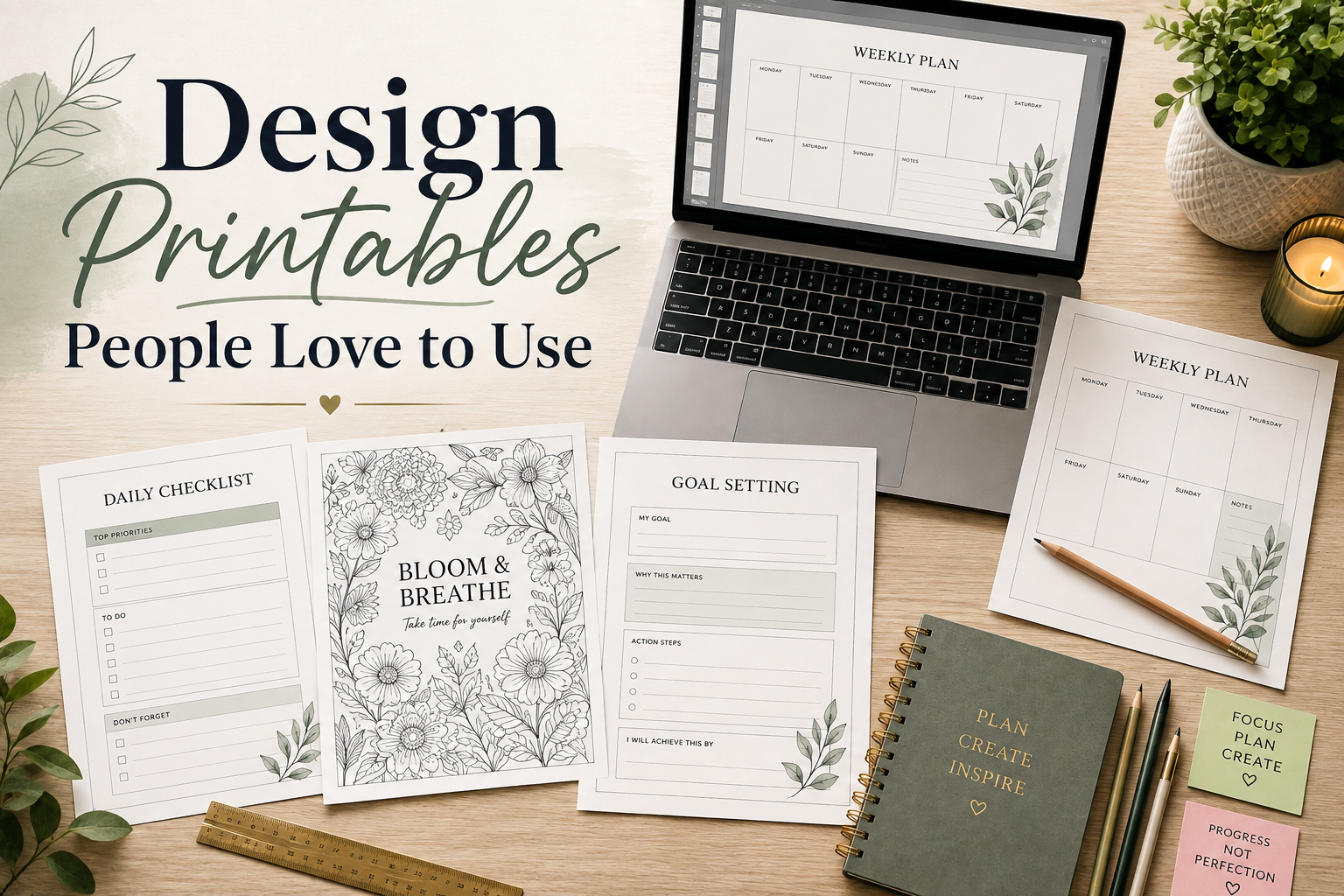
How to Design Printables That Customers Love to Use
Great printable design isn’t about making something look impressive – it’s about creating pages that people genuinely enjoy printing, using, and recommending.
When most people think about printable design, they picture beautiful graphics, elegant fonts, and eye-catching colors. Those things certainly have their place. But if you’ve ever downloaded a printable that looked amazing on the screen yet felt frustrating once it came out of the printer, you’ve experienced the difference between attractive design and effective design.
The most successful printable products don’t succeed because they’re flashy. They succeed because they solve a problem in a way that feels effortless for the customer. Whether you’re creating a coloring book, planner, worksheet, journal, activity pack, or educational resource, your design should guide the user naturally from beginning to end.
If you’re still deciding what to create, start with How to Validate Printable Product Ideas Before You Create Them. A well-designed product built around a poor idea is still a poor product. Likewise, if you’re looking for the complete end-to-end workflow – from idea generation through publishing and selling – The Complete Printable Product Creation System for Your Business provides the full roadmap. This article focuses on one important piece of that process: designing printables that customers genuinely enjoy using.
Practical Takeaways
Before diving into the details, here are the principles that drive great printable design:
These ideas may sound simple, but together they separate products customers use once from products they recommend to friends.
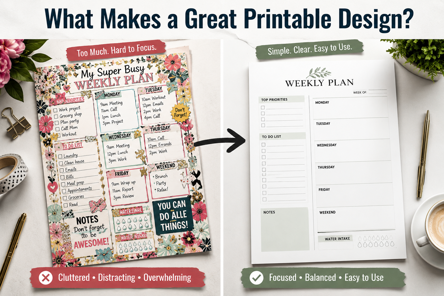
What Makes a Great Printable Design?
A printable can be visually stunning and still fail.
Why?
Because customers don’t buy printables to admire them – they buy them to use them.
A planner should make planning easier. A coloring page should be relaxing to color. A worksheet should be easy to understand. A journal should encourage writing, not get in the way of it.
Good printable design begins by asking one question:
Does this page help the customer accomplish what they wanted to do?
That’s the standard every design decision should be measured against.
| Attractive Design | Effective Printable Design |
|---|---|
| Decorative | Functional |
| Complex | Intuitive |
| Filled with graphics | Focused on usability |
| Looks impressive | Works effortlessly |
| Designed for the creator | Designed for the customer |
When in doubt, choose usability over decoration.
Start With the Purpose, Not the Decorations
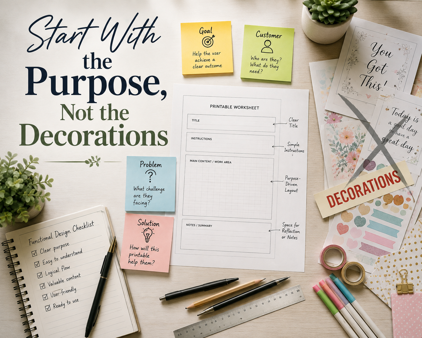
One of the easiest mistakes new creators make is opening their design software before they know what they’re actually building.
Instead, start by defining the job of the printable.
Ask yourself:
For example, imagine you’re designing a weekly planner. The temptation might be add decorative borders, floral illustrations, inspirational quotes, and multiple color accents. But if those additions leave little room for writing the planner has become less useful.
The same principle applies to coloring books. Intricate backgrounds may look beautiful in a product preview, but if they make the page exhausting to color, they reduce the customer’s enjoyment.
Every successful printable starts with clarity of purpose.
Build Around the Customer’s Experience

Great designers think beyond the page itself. They think about the experience of using it.
Imagine a customer printing your product at home. They open the PDF. They press Print. The page comes out. Now what?
Can they immediately understand what they’re looking at? Can they begin using it without confusion? Do they know where to write, color, check a box, or complete an activity?
Every moment of uncertainty creates friction. Reducing friction is one of the most valuable skills you can develop as a printable creator.
Simple improvements often make the biggest difference:
- Keep instructions short.
- Group related information together.
- Use headings that clearly describe each section.
- Avoid unnecessary visual clutter.
- Make the next step obvious.
The less your customer has to think about how to use the printable, the more they can focus on why they downloaded it in the first place
Keep Your Layout Consistent
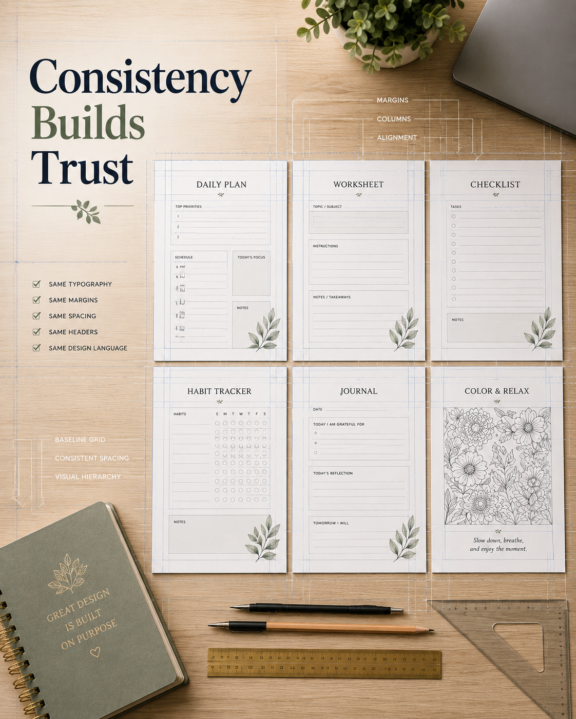
Consistency creates confidence.
When every page follows the same visual system, customers instinctively know where to look for information.
Consistency includes elements such as:
- Margins
- Headers
- Page titles
- Font choices
- Alignment
- Icon style
- Box sizes
- Spacing between sections
Consider a 40-page coloring book. If every page uses different title placements, inconsistent borders, and varying design styles, the product feels unfinished – even if every individual illustration is excellent.
On the other hand, a consistent layout creates a polished, professional experience that customers immediately recognize as intentional.
Consistency isn’t boring. It’s reassuring.
White Space Is One of Your Most Powerful Design Tools
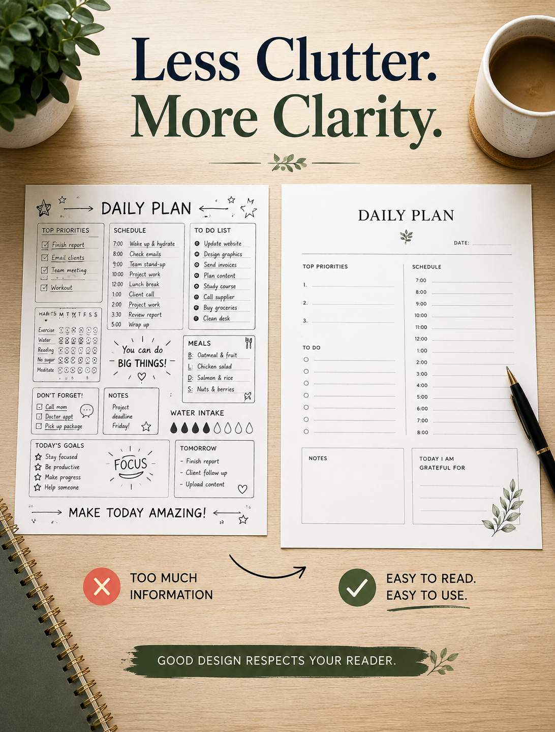
Many creators feel compelled to fill every inch of the page.
Resist that urge.
White space allows the eye to rest. It separates ideas. It improves readability. It gives users room to write, color or interact with the page comfortably.
Think of white space as breathing room for your design. Without it, even good content feels overwhelming.
Before finalizing a page, ask yourself:
- Does this section feel crowded?
- Could removing an element improve clarity?
- Is there enough room for the customer to actually use the page?
Often, deleting something creates a stronger design the adding something new.
Choose Fonts That Prioritize Readability
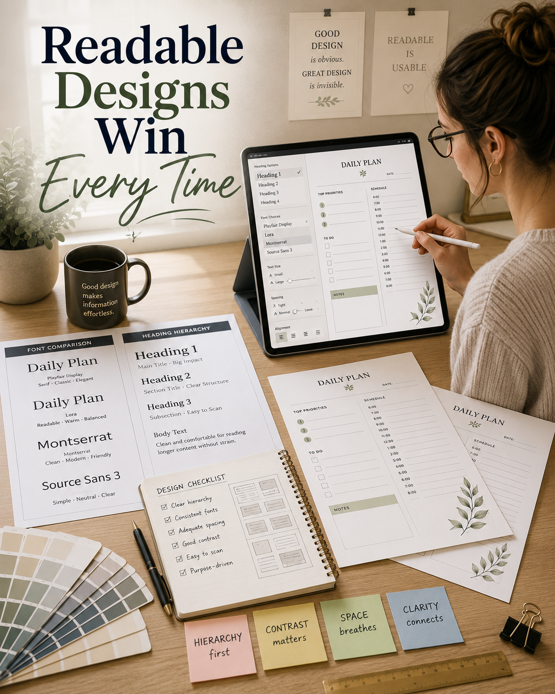
Typography has one primary responsibility:
Help people read.
Fancy script fonts can be beautiful in small doses, but they should rarely carry the weight of body text.
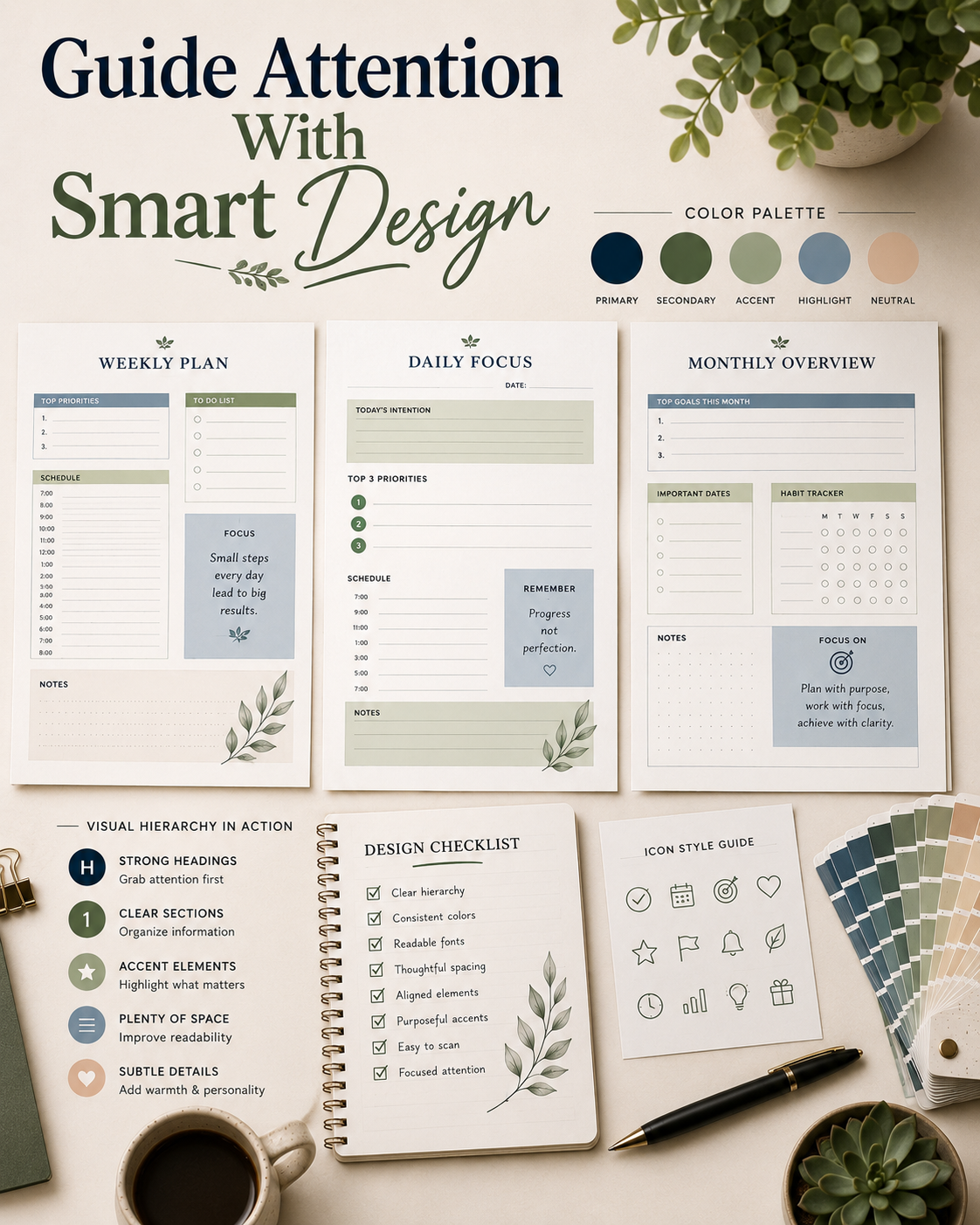
Choosing attractive fonts is only part of good printable design. Readers should immediately understand what information is most important simply by looking at the page. If you’d like to learn more about choosing readable typefaces, the free library at Google Fonts is an excellent place to explore professional font pairings and typography best practices.
A practical approach is to use:
- One font for headings.
- One font for body text.
- One optional accent font for decorative elements.
Keeping your typography simple also creates visual consistency throughout your product. Before publishing, print several pages and read them from arm’s length. If the text feels difficult to read, your customers will likely feel the same.
Design for Home Printers
Many customers use ordinary home printers. Design accordingly. Remember to consider:
- Standard 8.5″ x 11″ paper.
- Safe margins.
- Printer clipping.
- Ink consumption.
- Black-and-white printing.
- Paper thickness.
A printable that only works well on expensive equipment excludes a large portion of your audience. Whenever possible, test your products using an average printer – not just the highest-quality device available.
Real-world testing reveals issues you may never notice on a computer monitor.
Make Accessibility Part of Your Design Process
Accessibility isn’t only about accommodating disabilities. It’s about making products easier for everyone to use.
Simple improvements include:
- High contrast between text and background.
- Clear instructions.
- Large writing spaces.
- Readable font sizes.
- Logical information hierarchy.
- Avoiding color as the only indicator.
For example, instead of saying “Complete the items highlighted in green,” consider using labels, symbols, or numbered sections that remain understandable even when printed in grayscale.
Inclusive design almost always leads to a better customer experience.
Test Before You Publish
No printable should go live without testing. What looks perfect on a screen can reveal unexpected problems on paper.
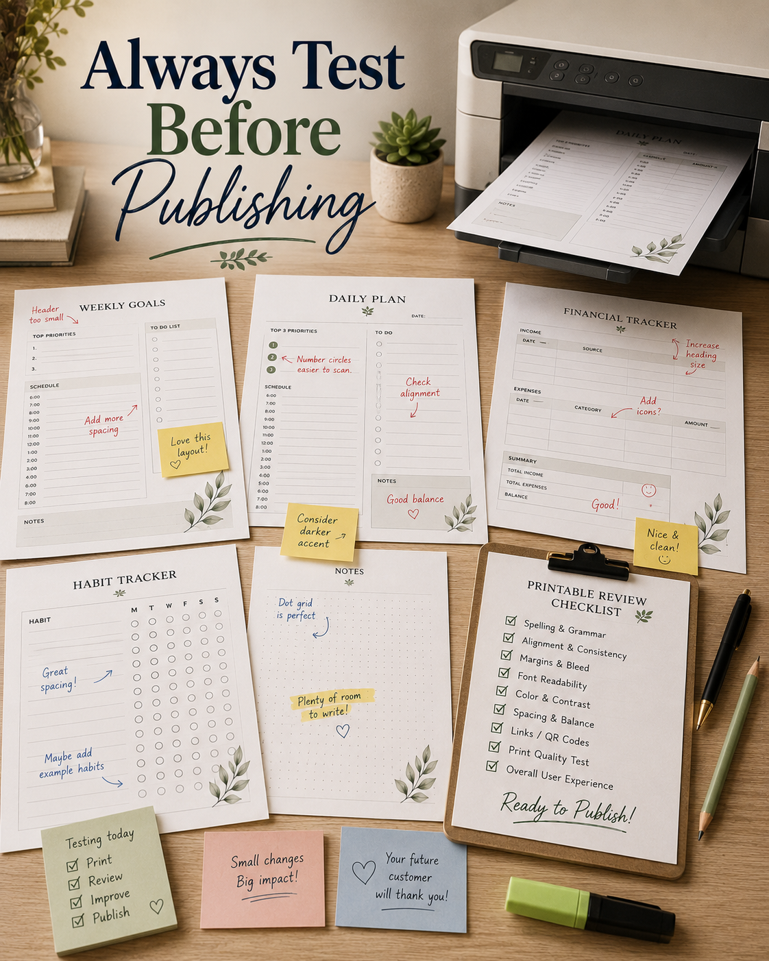
Create a simple testing routine:
This final review often catches small issues that would otherwise lead to customer frustration or unnecessary refund requests.
Within the complete workflow described in [art-001], print testing is one of the final quality-control steps before publishing.
Common Printable Design Mistakes
Even experienced creators occasionally fall into predictable traps. Here are some of the most common.
Trying to Impress Instead of Helping
A page overloaded with decorations often becomes harder to use.
Tiny Fonts
If customers need to squint, the font is too small.
Crowded Layouts
Leave enough room for writing, coloring, or completing activities comfortably.
Inconsistent Design
Switching styles from page to page weakens the overall product.
Ignoring Print Testing
Many avoidable problems only appear after printing.
Fortunately, every one of these mistakes is easy to fix once you recognize it.
Small Improvements That Make Customers Happier
Customers often remember the little details.
Simple additions can dramatically improve the overall experience:
- Page numbers
- Clear section dividers
- Helpful instructions
- Consistent headers
- Color testing page
- “This Book Belongs To” page
- Bonus printable pages
- Thank-you page
- Resource page
- Easy-to-follow file naming
None of these features are individually revolutionary. Together, they communicate quality and professionalism. That’s often the difference between a one-time buyer and a repeat customer.
Your Next Step
Design is only one piece of creating successful printable products, but it’s one that customers experience immediately.
As you work on your next printable, resist the temptation to ask, “How can I make this page look better?”
Instead, ask:
“How can I make this page easier to use?”
That single question has the power to improve nearly every design decision you make.
If you haven’t already, continue with The Complete Printable Product Creation System for Your Business to see how design fits into the complete creation workflow. If you’re still deciding what to build, revisit How to Validate Printable Product Ideas Before You Create Them before investing time in production.
The best printable businesses aren’t built by creating the most products. They’re built by creating products that customers genuinely enjoy using.
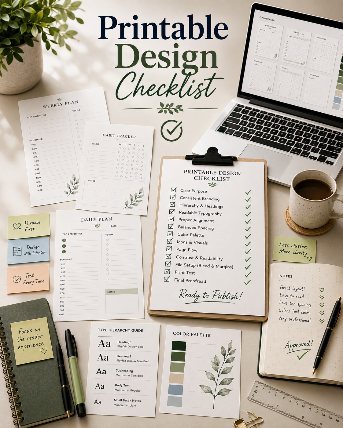
Practical Design Checklist
Related Reading
Continue building your printable publishing skills with these related articles:
- The Complete Printable Product Creation System for Your Business
- How to Validate Printable Product Ideas Before You Create Them
- How to Prepare Print-Ready PDF Files
- How to Price Printable Products
- How to Create Product Mockups That Increase Sales
Frequently Asked Questions
Join the Weekly Build Drops
Every week, I share real behind-the-scenes updates as I build Color Me Crazy Coloring Club in public. You’ll see new printable products, design decisions, lessons learned, publishing workflows, marketing experiments, and the wins and mistakes that come with growing a printable business from the ground up.
If you enjoy practical, transparent content that you can apply to your own projects, join Weekly Build Drops and follow the journey one build at a time.