
Outdated Printable Coloring Page Strategies Hurting Sales
The printable coloring pages market changed. Most creators did not.
If your printable coloring pages still look like a 2016 bundle dump, buyers will scroll right past. This post breaks down what is outdated now, why it hurts sales, and what to do instead.
The quick version
The printable coloring pages world has this weird habit of acting like nothing needs to change. Like it is still 2016 and everybody is throwing money at random mandala PDFs with blurry previews and Comic Sans titles. And yes, some creators are still doing exactly that.
Maybe that sounds harsh. Maybe it is. But markets evolve whether people feel emotionally prepared for it or not.
Right now, buyers are drifting toward creators who understand the full experience: comfort, usability, branding, and the feeling someone gets when the page comes out of the printer and they finally get a quiet moment.
People changed.
Creators did not.
At least not enough.
Outdated practice #1: Making generic printable coloring pages for “everyone”
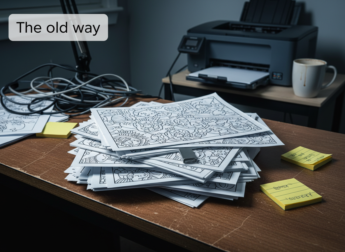
This one drives me slightly insane, if I am honest. You still see giant bundles labeled “Cute Animals Coloring Book” or “Stress Relief Patterns Vol. 14” as if buyers have not already scrolled past 7,000 nearly identical printable coloring pages listings before breakfast.
It might still work a little, barely, but it has no fingerprint.
What is happening now
Modern audiences want identity. They want printable coloring pages that feel oddly specific to them.
Someone obsessed with cozy rainy-day bookstores and cinnamon tea does not want the same vibe as a horror fan coloring possessed teddy bears under a blood moon. Those are two completely different emotional purchases.
A while back I saw a creator selling retro diner ghost coloring pages. Ghosts eating pancakes under neon signs. Ridiculous concept. Completely niche. And the comments were full of people saying, “Finally something different.”
That is the shift.
Specificity became the product.
What to do instead
- Pick one micro-world per product (cozy, spooky, retro, cottagecore, and so on).
- Write titles and previews like you are talking to one person.
- Build a recognizable signature (line weight, framing, bonus pages, tone).
Outdated practice #2: Stuffing printable coloring pages with tiny details nobody actually enjoys coloring
There was a strange period where creators thought hyper-detailed pages automatically meant “premium.” Tiny leaves inside tiny leaves inside microscopic spirals that looked like someone trapped a calculator inside a hedge maze.
Sure, on a screen it looked impressive.
Then people printed it.
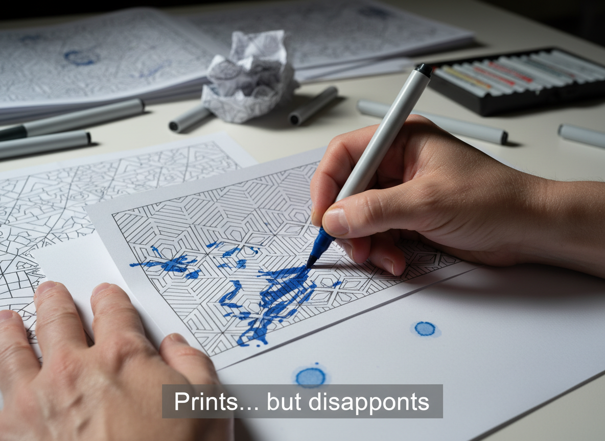
Markers bled through. Hands cramped. Eyes got tired. The page felt like homework.
Why it backfires
Most people using printable coloring pages today are not trying to prove artistic endurance. They are trying to relax. Escape. Slow their brain down for twenty minutes before bed.
Over-detail turns stress relief into stress.
What to do instead
- Design for printing first (test print at home.)
- Use stronger outlines and more breathing room.
- Leave space for markers and imperfect coloring.
That is normal.
Outdated practice #3: Selling printable coloring pages as dead PDFs with zero interaction
This might be the biggest mistake in the printable industry.
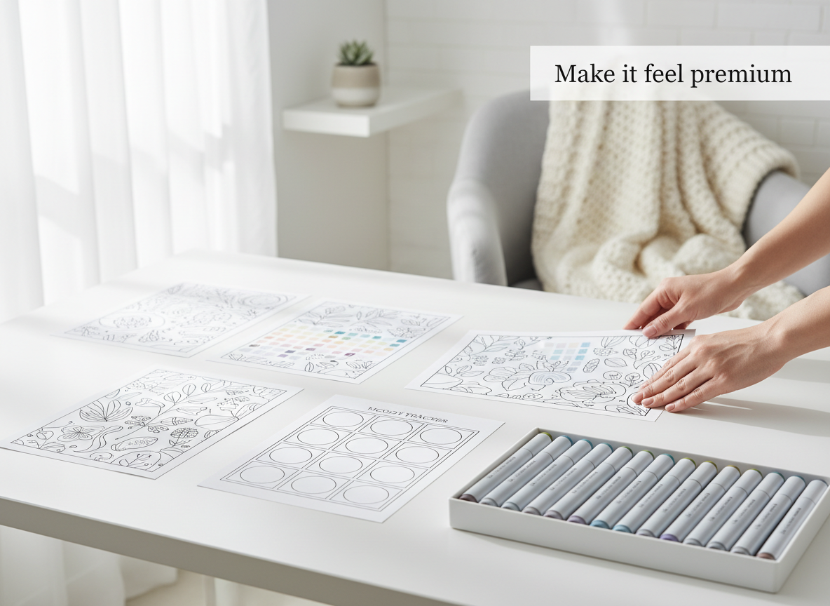
A plain ZIP folder with 40 pages and nothing else used to feel acceptable. Now it feels empty. Like being handed a puzzle box with half the pieces missing and someone insisting it is “premium.”
Modern buyers want engagement. Tiny experiences. Continuity.
What counts as interaction (without overcomplicating it)
- Swatch sheet
- Mood tracker
- Simple challenge card (color 7 days in a row)
- Bonus page drop later (even just one page)
- A themed extra like a cafe menu, passport stamp page, or mini checklist
What to do instead
- Add one to three extras per pack so it feels alive.
- Make the pack feel like a ritual, not a folder dump.
Outdated practice #4: Acting weirdly secretive about AI tools for printable coloring pages
This conversation gets messy fast online. But pretending AI does not exist is pointless.
Customers mostly care about results.
The real line buyers draw
If your printable coloring pages look repetitive, broken, or emotionally hollow, people notice fast.
If you use AI thoughtfully, then do cleanup, formatting, and real quality control, most buyers will not care. They will judge the final experience.
What to do instead
- Treat AI like a rough draft, not the final product.
- Build a quality-control habit: print tests, line cleanup, consistency checks.
- Make your style recognizable across products.
Outdated practice #5: Treating printable coloring pages like disposable dollar-bin content
This mindset quietly destroys creators from the inside out.
You will see “1,200 coloring pages for $2.99” and I am like, what are we doing here. That is not branding. That is panic disguised as productivity.
Cheap pricing attracts impatient buyers who do not value the work. Then creators burn out trying to out-volume everyone else. More pages. More uploads. More bundles. More SEO stuffing.
Eventually everything starts feeling factory-made.
What to do instead
- Price based on experience: theme cohesion, usability, presentation.
- Make previews clean and confident.
- Build collections that feel intentional (books, bundles, series).
People spend ridiculous money on stress relief already. Weighted blankets. Candles that smell like haunted libraries. Rain noise apps. Tiny desk fountains.
Coloring fits directly into that emotional ecosystem.
And sometimes printable coloring pages are not even about coloring pages. Sometimes they are about loneliness. Or anxiety. Or wanting thirty quiet minutes where your brain is not sprinting like a raccoon trapped inside a dryer.
That part matters more than most creators realize.
Conclusion: build printable coloring pages that feel worth printing
If there’s one big takeaway here, it’s this: printable coloring pages don’t sell because they exist. They sell because they feel good to use.
The old playbook was basically “make a ton of pages, toss them in a bundle, and hope the thumbnails do the heavy lifting.” That worked when the market was smaller and buyers had fewer options. But now? People can spot low-effort products fast—especially once they hit print.
If your pages are too generic, too cramped, or too inconsistent, the buyer experience breaks. And when the experience breaks, sales slow down, reviews get colder, and your product starts feeling disposable.
The better path is simple (not easy): treat your printables like a real product, not a file dump. Build a cohesive set. Make the pages enjoyable to color. Add small touches that make the download feel premium. Then keep iterating based on what real buyers respond to.
That’s how you stay relevant while everyone else keeps racing to the bottom.
Pro tip: run the “10-minute print test” before you publish
Before you list anything, do this quick check:
- Print 3 pages at home (one simple, on medium, one detailed).
- Color for 5 minutes on each page.
- Ask yourself:
- Did the lines stay clean?
- Did the page feel relaxing or annoying?
- Would I be happy if I paid for this?
If the answer isn’t a clear yes, don’t ship it yet. Fix the paper feel, spacing, line weight, and consistency first.
That one tiny habit will save you from publishing products that look fine on screen – but disappoint in real life.
Printable coloring pages (quick answers)
Join the Weekly Build Drops
If you are building printable coloring pages (or any printable offer) right now and trying to do it the modern way, I am documenting the whole thing in public: what I am testing, what is working, what flops, and what I am changing next.
Join Weekly Build Drops on my build-in-public site and I will send the real steps each week.